Overview
This web app was developed to model the effectiveness of UbiGro - an
alternative greenhouse covering that shifts light from the blue part
of the solar spectrum to the red, increasing the type of light that
plants use to grow. The app uses atmospheric parameters (AOD, Water
Vapor, ATM Pressure, Ozone & Albedo) from NASA's MERRA-2 dataset to
model cloudless solar irradiance for a selected location on the globe.
It then applies a filter, calculating the shift from red to blue
light, while considering the impact the type of greenhouse a customer
uses will have on the product's performance.
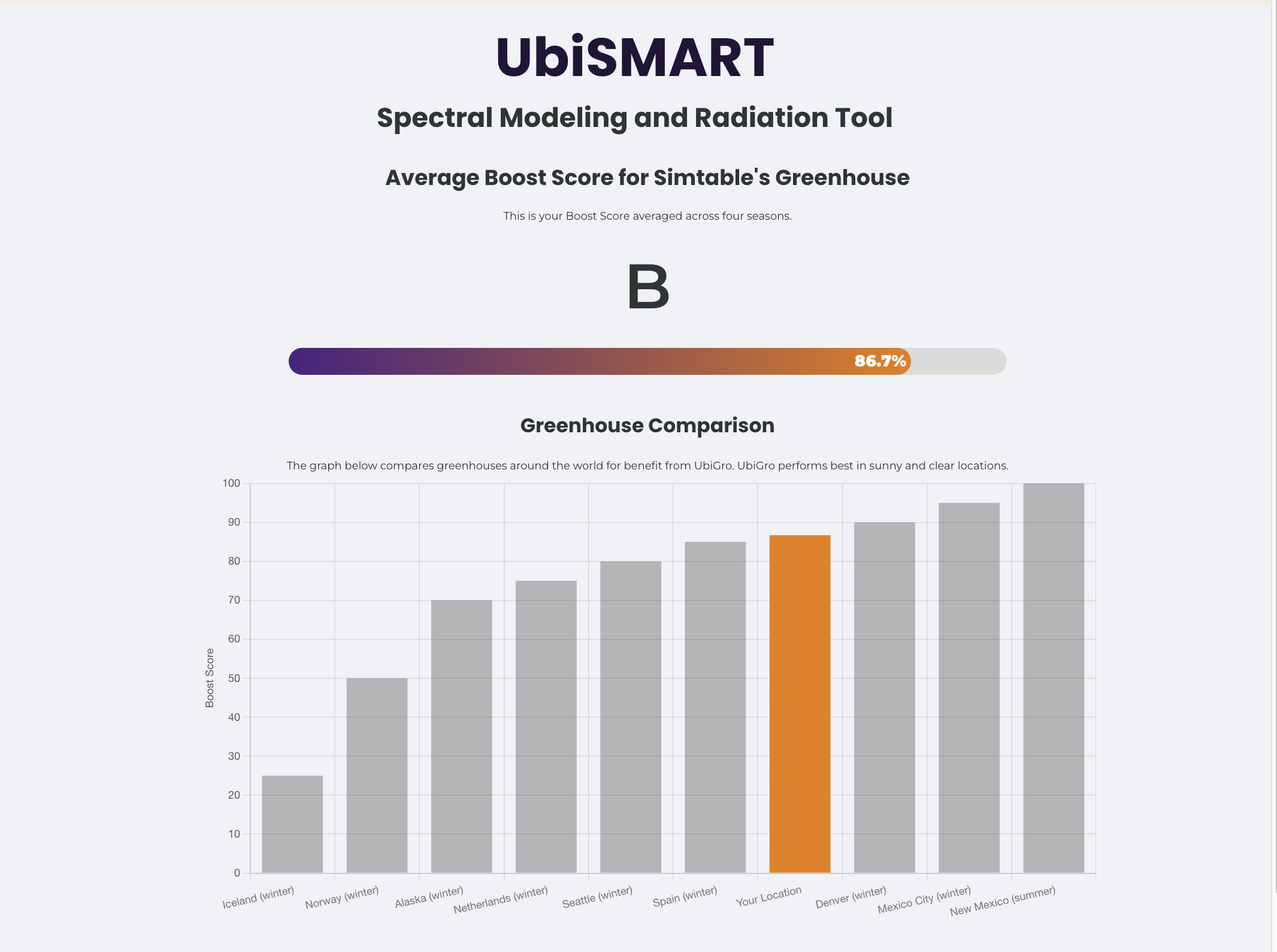
The user interface has a customer select their location on a map, then fills out other relevant information (crop type, greenhouse information), capturing data for potential customers.
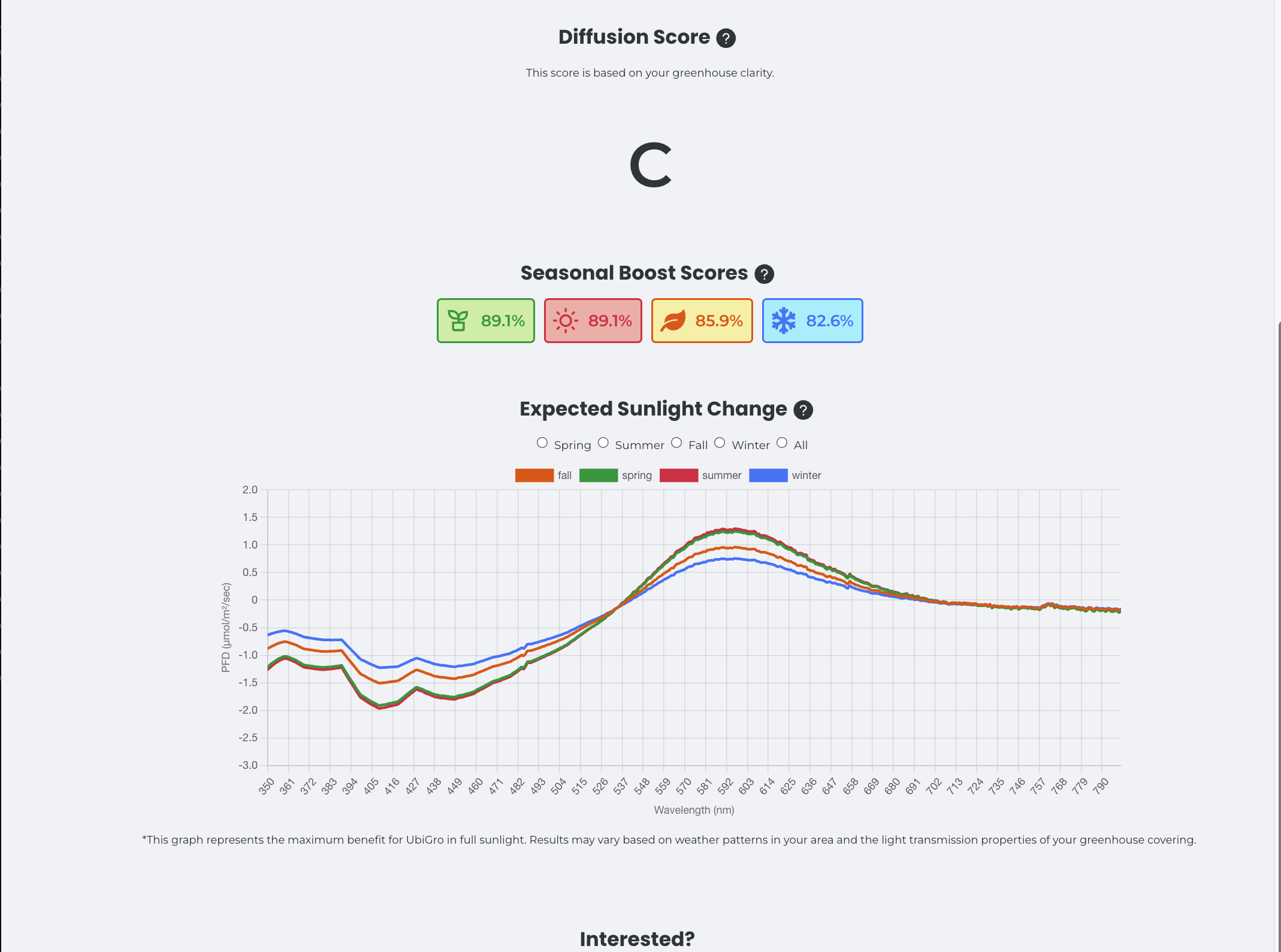
The next page displays results, specially calculated for each customer. They get a "score" and bar graph to compare with how the product performs in locations with pilot programs. They also get a seasonal solar spectra graph which shows a decrease in light in the blue wavelengths and increase in red wavelengths by season.
Technologies / Tools
- NetCDF, Pandas, Python
- Flask
- ChartJS, Leaflet, React
- Vercel + AWS EBS Instance
My role
For this project, I inherited python code that read NetCDF files and ran the code locally. I built a flask API, refactored the python code to ingest user input, built a react UI with interactive charts and launched the tool on the web with vercel and AWS Elastic Beanstalk. This was the first web app I built on my own! If I were to revisit the project there are a few optimizations I would make. The first being that MERRA-2 was not available on S3 in 2021. I would change the backend to access the data remotely, so the app could always use the latest data and stop hosting the files on the server. I also would no longer use React! It was overkill for a simple app like this.